HCP was retained and provided initial strategic planning workshops with senior leadership involvement. In post-strategic planning sessions, HCP conducted competitor research and a technology gap analysis prior to initiating an HCP proprietary branding and positioning platform. HCP worked with senior management to develop a new brand and position to more accurately represent why the company is different, what they are in business to do, and what companies would benefit most from its services. All this was completed within six months, with a public launch at the opening of the New Year. HCP then worked with C-suite management to create an annual budget to properly initiate and manage all advertising, marketing, and public relations for both traditional and digital mediums.
As the HCP team reviewed the competitive landscape, we tested many naming concepts among our stakeholder group and branded on what we found to be the most unique and distinctive approach that captured the essence of the leadership team’s corporate vision, mission, and values, which aligns with how they serve clients. The unanimous decision was to align with the founder’s South African heritage and incorporate a meaningful icon that relies on speed, agility, and customer-centric care to provide businesses with voice, data, and internet services.
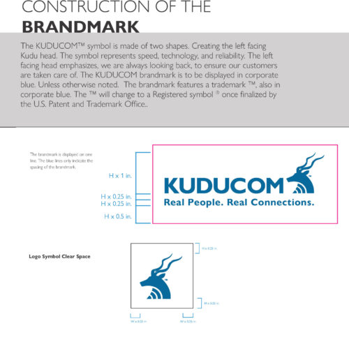
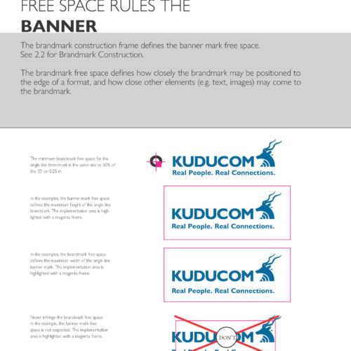
The name Kudu is derived from the indigenous Khoikhoi language of Southern Africa, and the species is prominent in South Africa. With a top speed of roughly 60 MPH, this large woodland antelope with large radar-like ears is highly alert and notoriously aware of their surroundings, making it a very unique symbol to represent the vision and mission of KUDUCOM and value-added services depending on speed, accuracy, and the ability to listen carefully in any environment. The forward-moving horns represent the different approach that KUDUCOM offers to its business clientele. The logo was specifically designed to illustrate forward thinking and speed, but with the Kudu looking back to the name preceding it to reiterate, the company is always looking back on how to service its clients better.
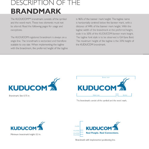
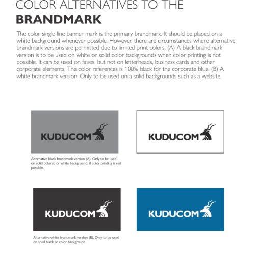
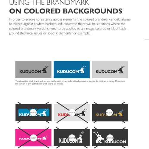
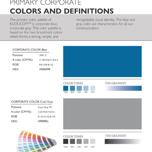
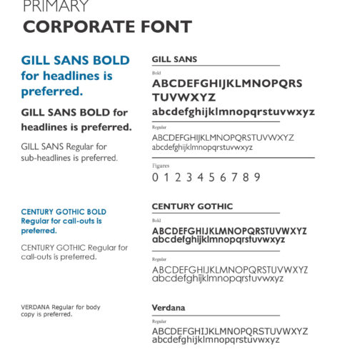
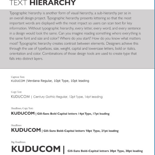
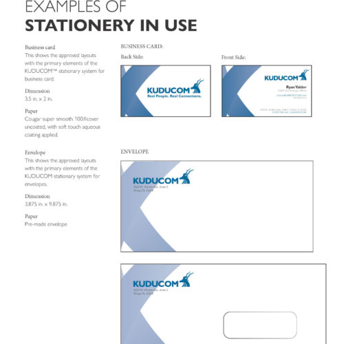
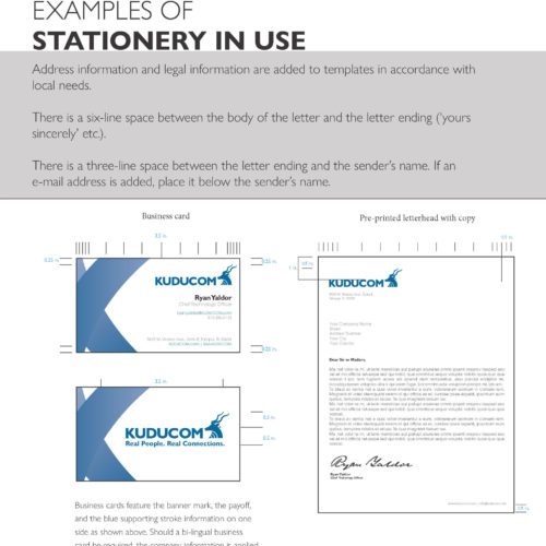
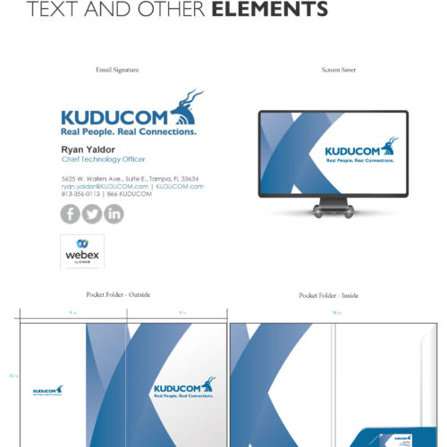
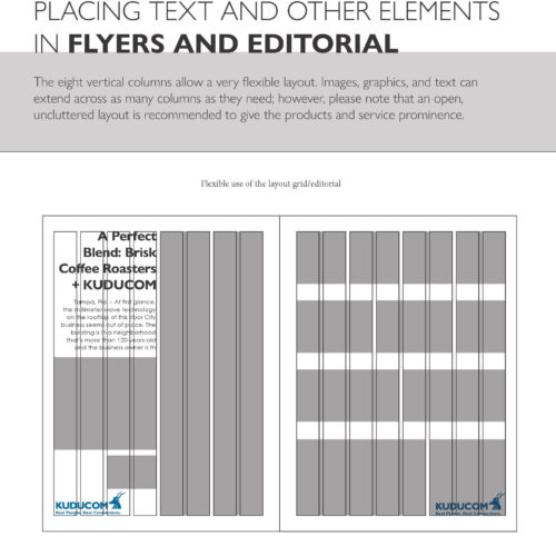
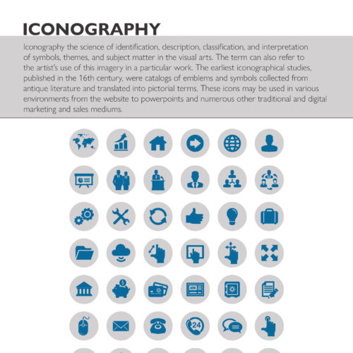
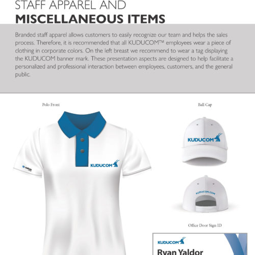
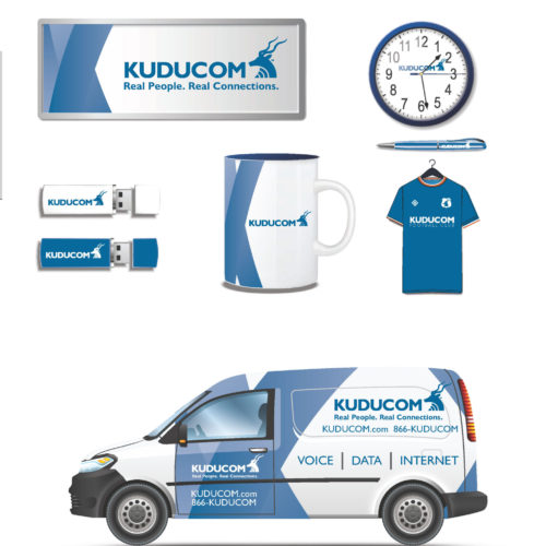
Below are various launch elements ranging from a full brand guide and website to building signage and fleet vehicle wraps.


